Modeling Mortality Trends with Functional Forecasting
Source:vignettes/mortality-analysis.Rmd
mortality-analysis.RmdIntroduction
Mortality patterns represent one of the most fundamental demographic
processes, yet traditional statistical approaches often miss the
complex, evolving functional relationships between age and death rates
over time. This vignette demonstrates how functional forecasting using
the ffc package captures these dynamic relationships that
change shape—not just magnitude—over time.
What makes mortality data ideal for functional forecasting?
- Complex age patterns: Mortality exhibits characteristic J-shaped curves across age groups
- Temporal evolution: These functional relationships shift
systematically over time
- Smooth transitions: Changes occur gradually, making them suitable for GAM-based smoothing
- Forecasting relevance: Understanding future mortality trends has critical policy implications
Key concepts we’ll explore
- Time-varying coefficients: How functional relationships evolve over time
- Hierarchical smoothing: Modeling shared trends with group-specific
deviations
- Functional forecasting: Predicting entire curves into the future
- Model diagnostics: Validating functional time series models
Data exploration
We’ll use Queensland mortality data spanning 1980-2020, containing death counts by age, sex, and year with corresponding population denominators.
data("qld_mortality")
head(qld_mortality, 15)
#> # A tsibble: 15 x 5 [1Y]
#> # Key:       age, sex [1]
#>     year   age sex    deaths population
#>    <int> <int> <fct>   <dbl>      <dbl>
#>  1  1980     0 female    190     17700.
#>  2  1981     0 female    175     18785.
#>  3  1982     0 female    190     19698.
#>  4  1983     0 female    165     19908.
#>  5  1984     0 female    148     19573.
#>  6  1985     0 female    164     19458.
#>  7  1986     0 female    147     19405.
#>  8  1987     0 female    159     19421.
#>  9  1988     0 female    153     19841.
#> 10  1989     0 female    184     20942.
#> 11  1990     0 female    155     21841.
#> 12  1991     0 female    143     22187.
#> 13  1992     0 female    154     22314.
#> 14  1993     0 female    149     22581.
#> 15  1994     0 female    109     22859.
The dataset structure is ideal for functional analysis: we have a functional predictor (age) whose relationship with the outcome (mortality) changes over time (year), with hierarchical structure (sex).
Visualizing mortality patterns
ggplot(
  data = qld_mortality,
  aes(
    x = age,
    y = deaths / population,
    group = year,
    colour = year
  )
) +
  geom_line(alpha = 0.7) +
  facet_wrap(~sex) +
  scale_colour_viridis_c(name = "Year") +
  labs(
    x = "Age",
    y = "Mortality rate",
    title = "Queensland mortality patterns over time"
  ) +
  scale_y_log10()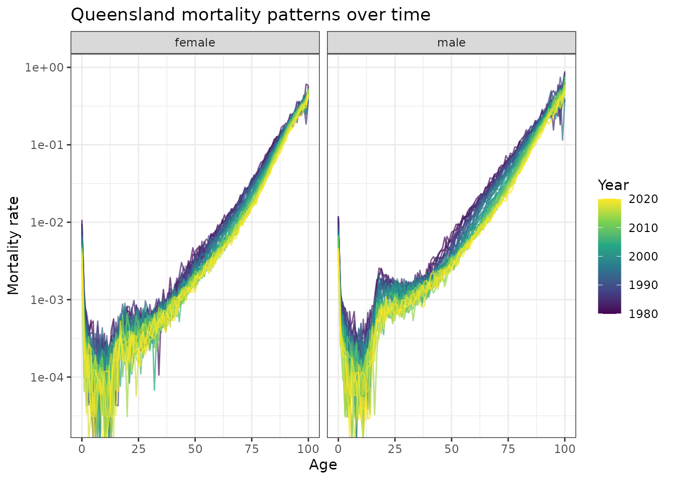
Observed mortality rates by age in Queensland, 1980-2020. The characteristic J-shaped curves show systematic downward shifts over time, indicating mortality improvements across all age groups.
Key observations:
- J-shaped curves: High infant mortality, low childhood mortality, exponential increase with age
- Temporal shifts: Consistent downward movement of entire curves over
time
- Sex differences: Males consistently higher mortality, similar temporal patterns
- Functional evolution: The shape itself evolves, not just vertical shifts
- Overall decline: Mortality rates have declined substantially across all ages, reflecting major improvements in healthcare, lifestyle, and living conditions
Functional modeling approach
Why traditional models fall short
Standard approaches might model this as:
# Traditional approach - misses functional evolution
glm(deaths ~ age + year + sex, family = poisson(), offset = log(population))
This assumes linear age effects and additive time trends—clearly inadequate for evolving functional relationships.
The ffc solution: time-varying coefficients
The fts() function creates basis functions whose
coefficients evolve over time, capturing how the age-mortality
relationship changes:
mod <- ffc_gam(
  deaths ~
    offset(log(population)) +
    sex +
    age +
    # Time-varying level: shared temporal trends
    fts(
      year,
      mean_only = TRUE,
      bs = "tp",
      time_k = 35,
      time_m = 1
    ) +
    # Time-varying age effects: sex-specific deviations
    fts(
      age,
      by = sex,
      bs = "tp",
      time_k = 15,
      time_m = 1
    ),
  time = "year",
  data = qld_mortality,
  family = poisson(),
  # Efficient for large datasets
  engine = "bam"
)
Understanding the model structure
summary(mod)
#>
#> Family: poisson
#> Link function: log
#>
#> Formula:
#> deaths ~ sex + age + offset(log(population)) + s(year, by = fts_year1_mean,
#>     bs = "ts", k = 35, m = 1, id = 1) + s(year, by = fts_bs_s_age_bysexfemale_1,
#>     bs = "ts", k = 15, m = 1, id = 2) + s(year, by = fts_bs_s_age_bysexfemale_2,
#>     bs = "ts", k = 15, m = 1, id = 2) + s(year, by = fts_bs_s_age_bysexfemale_3,
#>     bs = "ts", k = 15, m = 1, id = 2) + s(year, by = fts_bs_s_age_bysexfemale_4,
#>     bs = "ts", k = 15, m = 1, id = 2) + s(year, by = fts_bs_s_age_bysexfemale_5,
#>     bs = "ts", k = 15, m = 1, id = 2) + s(year, by = fts_bs_s_age_bysexfemale_6,
#>     bs = "ts", k = 15, m = 1, id = 2) + s(year, by = fts_bs_s_age_bysexfemale_7,
#>     bs = "ts", k = 15, m = 1, id = 2) + s(year, by = fts_bs_s_age_bysexfemale_8,
#>     bs = "ts", k = 15, m = 1, id = 2) + s(year, by = fts_bs_s_age_bysexfemale_9,
#>     bs = "ts", k = 15, m = 1, id = 2) + s(year, by = fts_bs_s_age_bysexmale_1,
#>     bs = "ts", k = 15, m = 1, id = 2) + s(year, by = fts_bs_s_age_bysexmale_2,
#>     bs = "ts", k = 15, m = 1, id = 2) + s(year, by = fts_bs_s_age_bysexmale_3,
#>     bs = "ts", k = 15, m = 1, id = 2) + s(year, by = fts_bs_s_age_bysexmale_4,
#>     bs = "ts", k = 15, m = 1, id = 2) + s(year, by = fts_bs_s_age_bysexmale_5,
#>     bs = "ts", k = 15, m = 1, id = 2) + s(year, by = fts_bs_s_age_bysexmale_6,
#>     bs = "ts", k = 15, m = 1, id = 2) + s(year, by = fts_bs_s_age_bysexmale_7,
#>     bs = "ts", k = 15, m = 1, id = 2) + s(year, by = fts_bs_s_age_bysexmale_8,
#>     bs = "ts", k = 15, m = 1, id = 2) + s(year, by = fts_bs_s_age_bysexmale_9,
#>     bs = "ts", k = 15, m = 1, id = 2)
#>
#> Parametric coefficients:
#>              Estimate Std. Error z value Pr(>|z|)
#> (Intercept)  3.371181   2.488125   1.355 0.175447
#> sexmale      0.574306   0.004986 115.189  < 2e-16 ***
#> age         -0.180386   0.049764  -3.625 0.000289 ***
#> ---
#> Signif. codes:  0 '***' 0.001 '**' 0.01 '*' 0.05 '.' 0.1 ' ' 1
#>
#> Approximate significance of smooth terms:
#>                                       edf Ref.df   Chi.sq p-value
#> s(year):fts_year1_mean             32.048     34 10329.34  <2e-16 ***
#> s(year):fts_bs_s_age_bysexfemale_1 14.470     15 11934.09  <2e-16 ***
#> s(year):fts_bs_s_age_bysexfemale_2 12.621     15  9711.83  <2e-16 ***
#> s(year):fts_bs_s_age_bysexfemale_3 14.477     15    68.77  <2e-16 ***
#> s(year):fts_bs_s_age_bysexfemale_4 13.307     15  7609.29  <2e-16 ***
#> s(year):fts_bs_s_age_bysexfemale_5 14.505     15   498.50  <2e-16 ***
#> s(year):fts_bs_s_age_bysexfemale_6 13.147     15  7787.91  <2e-16 ***
#> s(year):fts_bs_s_age_bysexfemale_7 14.265     15   712.25  <2e-16 ***
#> s(year):fts_bs_s_age_bysexfemale_8  9.615     15 11101.16  <2e-16 ***
#> s(year):fts_bs_s_age_bysexfemale_9 11.815     15    39.30  <2e-16 ***
#> s(year):fts_bs_s_age_bysexmale_1   14.347     15  7385.09  <2e-16 ***
#> s(year):fts_bs_s_age_bysexmale_2   12.758     15  9625.52  <2e-16 ***
#> s(year):fts_bs_s_age_bysexmale_3   14.606     15   106.51  <2e-16 ***
#> s(year):fts_bs_s_age_bysexmale_4   13.620     15  9829.84  <2e-16 ***
#> s(year):fts_bs_s_age_bysexmale_5   14.601     15  1741.23  <2e-16 ***
#> s(year):fts_bs_s_age_bysexmale_6   13.601     15  9939.09  <2e-16 ***
#> s(year):fts_bs_s_age_bysexmale_7   14.438     15   308.23  <2e-16 ***
#> s(year):fts_bs_s_age_bysexmale_8    9.738     15 12228.38  <2e-16 ***
#> s(year):fts_bs_s_age_bysexmale_9   11.218     15    72.68  <2e-16 ***
#> ---
#> Signif. codes:  0 '***' 0.001 '**' 0.01 '*' 0.05 '.' 0.1 ' ' 1
#>
#> R-sq.(adj) =  0.986   Deviance explained = 97.6%
#> fREML =  22150  Scale est. = 1         n = 8282
Key components:
- Fixed effects:
sexcaptures baseline male-female differences,agecaptures baseline mortality rates per age - Time-varying level:
fts(year, mean_only = TRUE)models shared temporal trends
- Time-varying functions:
fts(age, by = sex)captures how age patterns evolve differently by sex
The model automatically creates a hierarchical structure where basis
functions become by variables in smooths of time, sharing
smoothing parameters for computational efficiency.
Model interpretation
Predicted functional curves
newdat <- qld_mortality
newdat$population <- 1  # Standardized predictions

newdat$preds <- predict(
  mod,
  newdata = newdat,
  type = "response"
)

ggplot(
  data = newdat,
  aes(
    x = age,
    y = preds,
    group = year,
    colour = year
  )
) +
  geom_line() +
  facet_wrap(~sex) +
  scale_colour_viridis_c(name = "Year") +
  labs(
    x = "Age",
    y = "Expected mortality rate",
    title = "Model predictions: evolving mortality patterns"
  ) +
  scale_y_log10()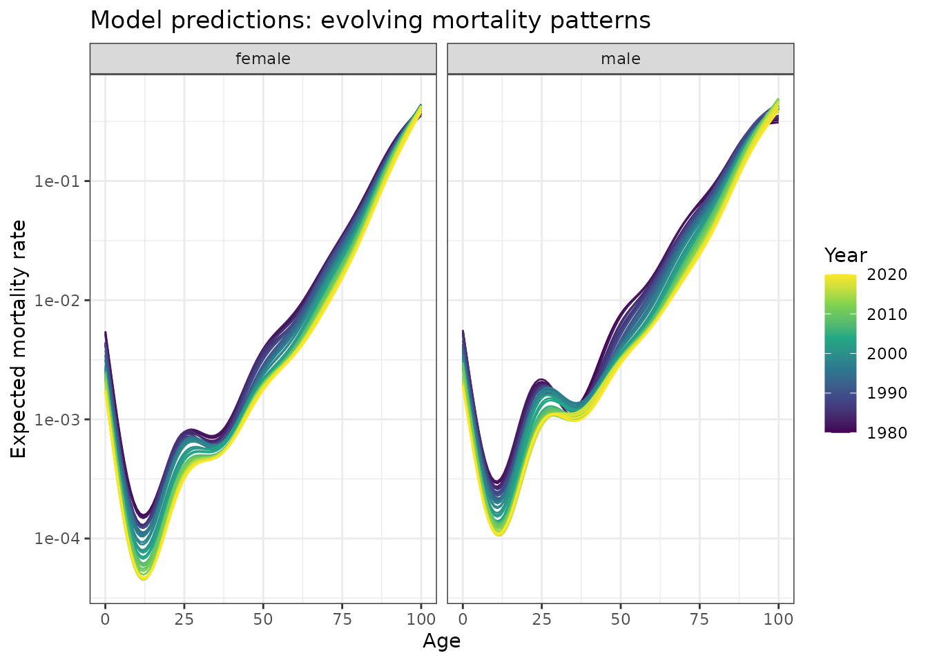
Model predictions showing expected mortality curves by age and year. Smooth curves demonstrate systematic evolution of the age-mortality relationship over four decades.
The model successfully captures the smooth evolution of J-shaped mortality curves while preserving the characteristic functional form. The downward trend across all mortality curves demonstrates substantial improvement in survival rates over the 40-year period. This reflects major advances in healthcare, improved living conditions, better nutrition, and reduced exposure to environmental hazards. Notably, the decline is not uniform across all ages - the model captures how the rate of improvement varies by age group and sex, with some periods showing more rapid mortality decline than others.
Focused analysis: teenage mortality trends
Let’s examine how mortality patterns changed for a specific age group
by leveraging the power of marginaleffects:
plot_predictions(
  mod,
  by = c("year", "sex"),
  newdata = datagrid(
    age = 17,
    year = unique,
    sex = unique,
    population = 1
  ),
  type = "response"
) +
  labs(
    x = "Year",
    y = "Expected mortality rate",
    title = "Teenage mortality trends over time"
  ) +
  scale_y_log10()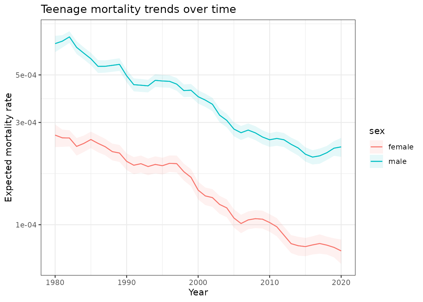
Predicted mortality trends for 17-year-olds in Queensland, 1980-2020. Shows approximately 70% decline in mortality rates with consistent male-female differences.
Rate of change analysis
We can look deeper at these predictions to understand how
fast mortality is improving, again using
marginaleffects support:
plot_slopes(
  mod,
  variables = "year",
  by = c("year", "sex"),
  newdata = datagrid(
    age = 17,
    year = unique,
    sex = unique,
    population = 1
  ),
  type = "response"
) +
  labs(
    x = "Year",
    y = "Rate of mortality change",
    title = "Speed of mortality improvement over time"
  ) +
  geom_hline(
    yintercept = 0,
    linetype = "dashed",
    alpha = 0.7
  )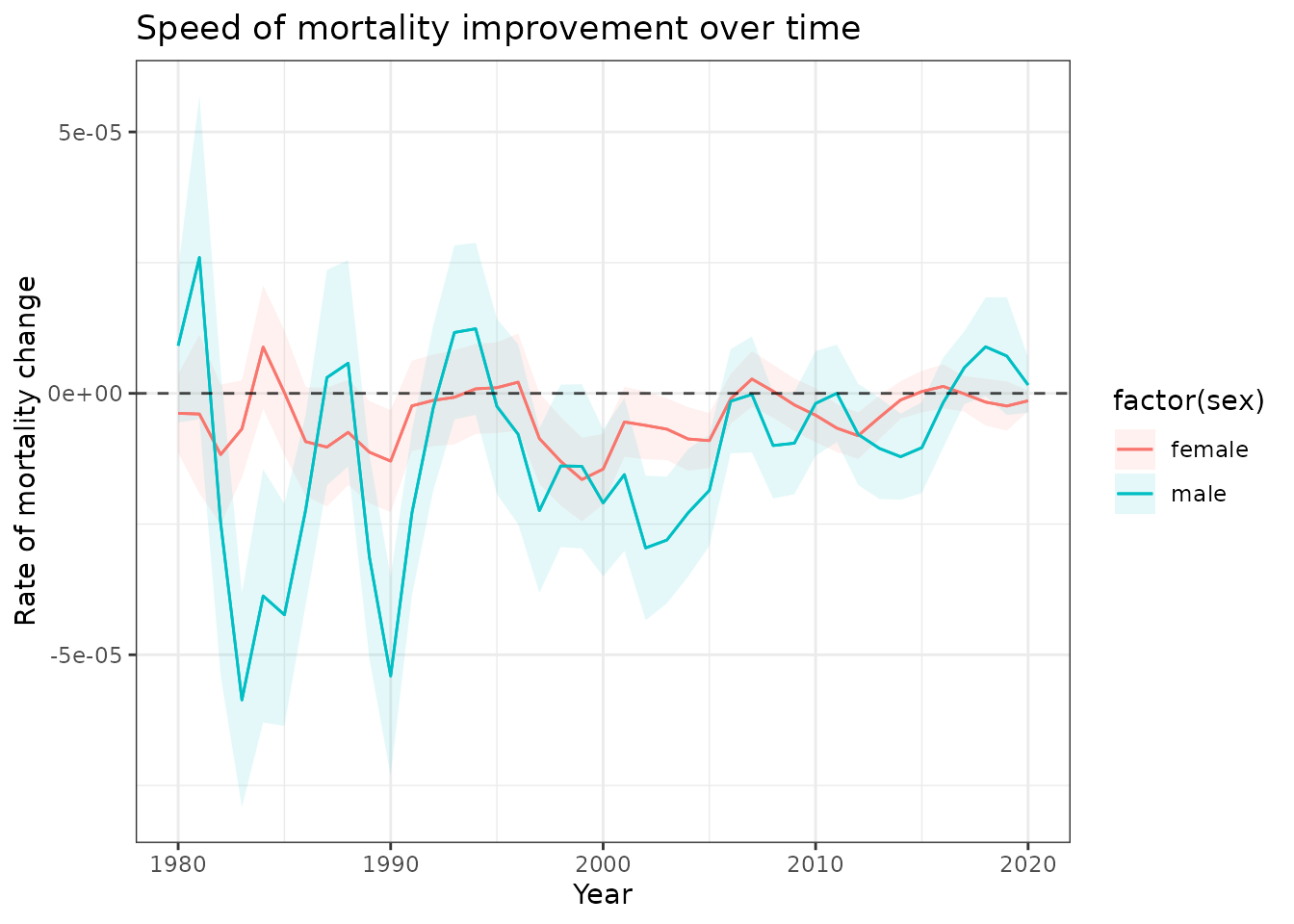
First derivatives showing the rate of mortality improvement for 17-year-olds. Fluctuations reveal periods of faster and slower mortality decline.
Extracting time-varying coefficients
The power of functional forecasting lies in treating the evolving coefficients as time series that can be forecasted:
functional_coefs <- fts_coefs(
  mod,
  summary = FALSE,
  times = 10
)
functional_coefs
#> # A tibble: 19,475 × 6
#>    .basis         .parameter .time .estimate .realisation  year
#>  * <chr>          <chr>      <int>     <dbl>        <int> <int>
#>  1 fts_year1_mean location    1980     0.356            1  1980
#>  2 fts_year1_mean location    1981     0.368            1  1981
#>  3 fts_year1_mean location    1982     0.403            1  1982
#>  4 fts_year1_mean location    1983     0.319            1  1983
#>  5 fts_year1_mean location    1984     0.324            1  1984
#>  6 fts_year1_mean location    1985     0.318            1  1985
#>  7 fts_year1_mean location    1986     0.259            1  1986
#>  8 fts_year1_mean location    1987     0.247            1  1987
#>  9 fts_year1_mean location    1988     0.234            1  1988
#> 10 fts_year1_mean location    1989     0.265            1  1989
#> # ℹ 19,465 more rows
Visualizing coefficient evolution
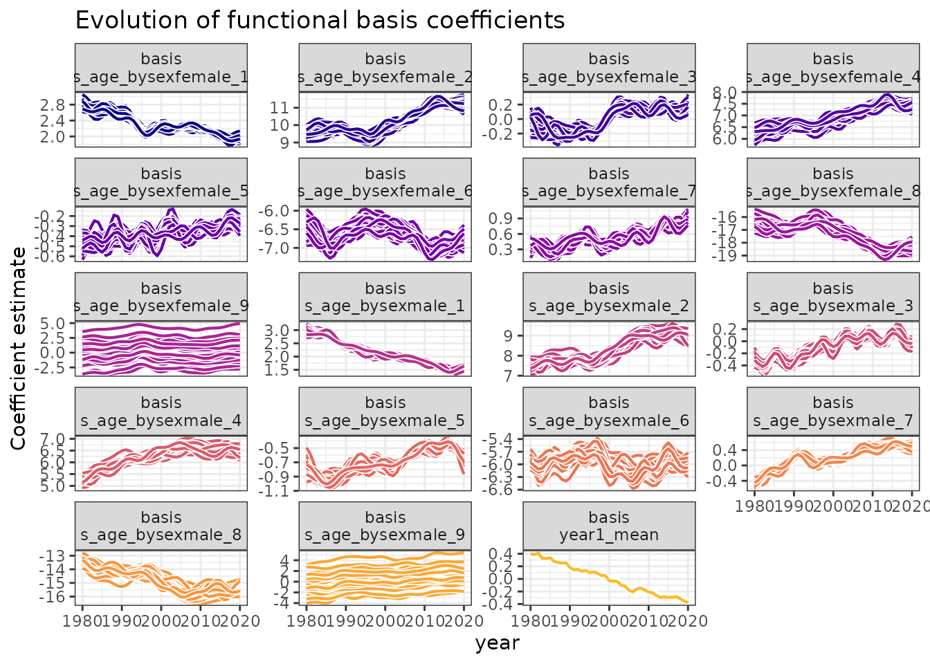
Time series of functional basis coefficients. Each panel shows how different aspects of the age-mortality relationship evolved over time, revealing complex temporal dependencies.
Interpretation:
- Complex patterns: Each coefficient series shows distinct temporal behavior
- Smooth evolution: Changes occur gradually, suitable for time series modeling
- Interdependence: Multiple coefficients work together to create the functional evolution
Forecasting mortality patterns
Coefficient forecasting
functional_fc <- forecast(
  object = functional_coefs,
  h = 5,      # 5-year horizon
  times = 10, # Forecast replicates
  model = "ARIMA"
)
functional_fc
#> # A tsibble: 59,375 x 6 [1Y]
#> # Key:       .basis, .realisation, .model, .rep [11,875]
#>    .basis                     .realisation .model  year .rep   .sim
#>    <chr>                             <int> <chr>  <dbl> <chr> <dbl>
#>  1 fts_bs_s_age_bysexfemale_1            1 ARIMA   2021 1      1.96
#>  2 fts_bs_s_age_bysexfemale_1            1 ARIMA   2022 1      1.92
#>  3 fts_bs_s_age_bysexfemale_1            1 ARIMA   2023 1      1.86
#>  4 fts_bs_s_age_bysexfemale_1            1 ARIMA   2024 1      1.81
#>  5 fts_bs_s_age_bysexfemale_1            1 ARIMA   2025 1      1.78
#>  6 fts_bs_s_age_bysexfemale_1            1 ARIMA   2021 10     1.96
#>  7 fts_bs_s_age_bysexfemale_1            1 ARIMA   2022 10     1.93
#>  8 fts_bs_s_age_bysexfemale_1            1 ARIMA   2023 10     1.88
#>  9 fts_bs_s_age_bysexfemale_1            1 ARIMA   2024 10     1.86
#> 10 fts_bs_s_age_bysexfemale_1            1 ARIMA   2025 10     1.86
#> # ℹ 59,365 more rows
The forecast includes uncertainty in both the time series models and the original coefficient estimation, providing realistic prediction intervals.
Future mortality patterns
Let’s demonstrate how to generate complete mortality curve forecasts by combining the forecasted coefficients with the model structure. Here we will use the ensemble model (“ENS”) to forecast the time-varying mean, which tends to give more robust forecasts than any of the mdoels on their own:
# Create forecast data for future years
future_years <- 2021:2025
newdata_forecast <- expand.grid(
  age = unique(qld_mortality$age),
  sex = unique(qld_mortality$sex),
  year = future_years,
  population = 1
)

# Generate forecasted mortality curves using forecast()
# This integrates the time series forecasts of coefficients
mortality_forecasts <- forecast(
  object = mod,
  newdata = newdata_forecast,
  model = "ARIMA",
  mean_model = "ENS",
  type = "expected"
)
head(mortality_forecasts)
#> # A tibble: 6 × 6
#>   .estimate  .error    .q2.5     .q10     .q90   .q97.5
#>       <dbl>   <dbl>    <dbl>    <dbl>    <dbl>    <dbl>
#> 1  0.00167  0.00161 0.00107  0.00130  0.00236  0.00318
#> 2  0.00105  0.00109 0.000683 0.000776 0.00125  0.00204
#> 3  0.000665 0.00142 0.000431 0.000512 0.000788 0.00104
#> 4  0.000446 0.00226 0.000285 0.000358 0.000558 0.000747
#> 5  0.000285 0.00232 0.000190 0.000216 0.000360 0.000428
#> 6  0.000194 0.00141 0.000113 0.000144 0.000241 0.000330

# Plot forecasted mortality rates, together with uncertainties
ggplot(mortality_forecasts |>
         dplyr::bind_cols(newdata_forecast),
       aes(x = age,
           y = .estimate,
           group = year,
           colour = year)) +
  geom_ribbon(aes(
    ymin = .q10,
    ymax = .q90,
    fill = year
  ),
  alpha = 0.2,
  colour = NA) +
  geom_line() +
  facet_wrap(~sex) +
  scale_colour_viridis_c(name = "Year") +
  scale_fill_viridis_c(name = "Year") +
  labs(
    x = "Age",
    y = "Mortality rate",
    title = "Expected mortality"
  ) +
  scale_y_log10()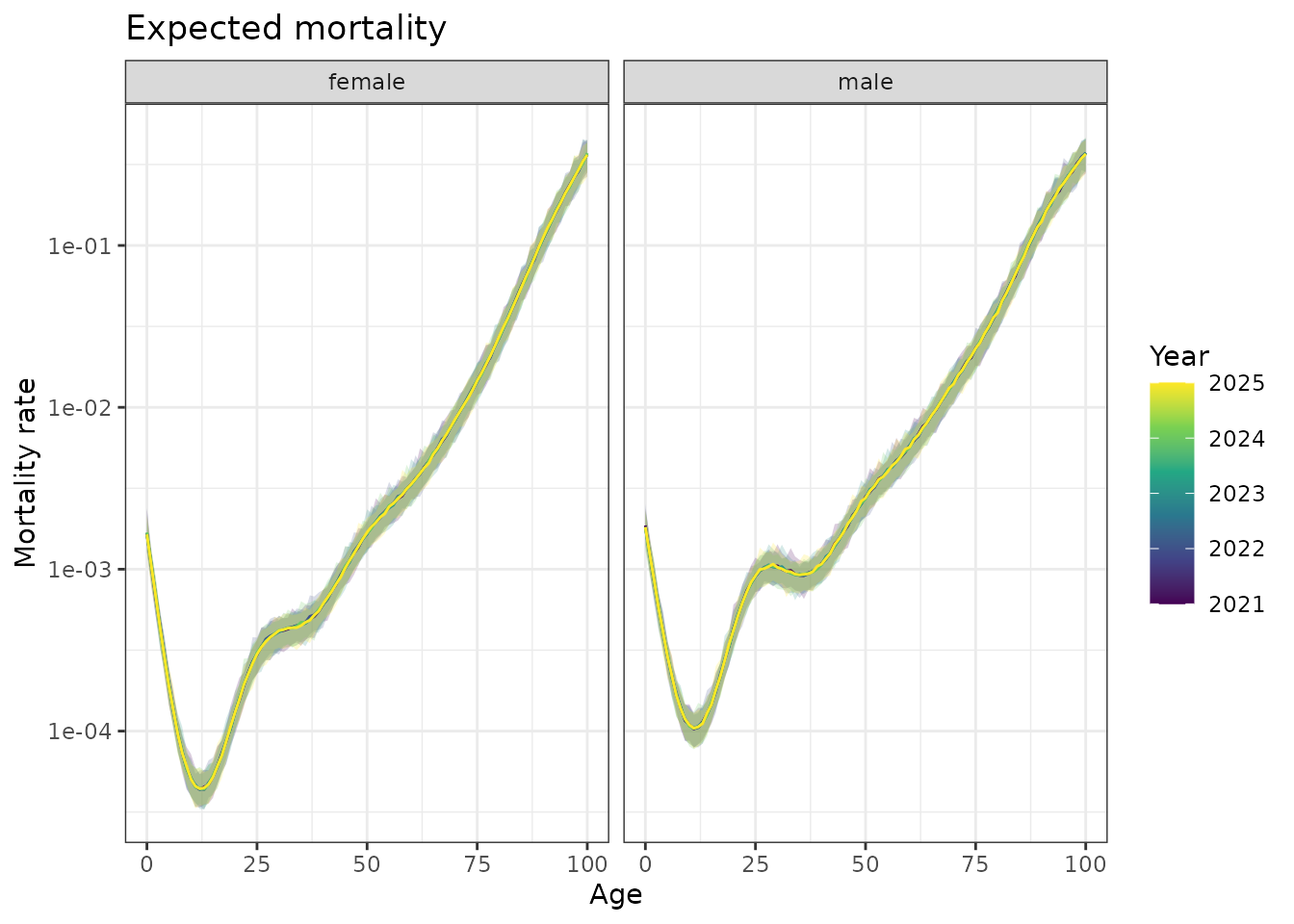
Forecasted mortality curves for Queensland, 2021-2025. Shows how the functional forecasting approach predicts future age-mortality patterns.
This forecasting approach enables prediction of entire functional
relationships by combining time series forecasts of the functional
coefficients with the underlying model structure. We could easily then
convert this to a fable object (using
as_fable()) and compare with holdout data to compute any of
the forecast scores supported by fable.
Key insights and methodology
What we learned about Queensland mortality
- Systematic improvement: Mortality declined across all age groups over 40 years
- Functional evolution: Changes involved curve shape, not just magnitude shifts
- Heterogeneous trends: Rate of improvement varied by age and sex
- Complex patterns: Simple parametric models would miss these relationships
Why functional forecasting matters
- Captures complexity: Models evolving functional relationships traditional methods miss
- Preserves structure: Maintains biological/physical constraints in
forecasts
- Quantifies uncertainty: Propagates uncertainty through the entire functional evolution
- Policy relevance: Enables sophisticated demographic projections
Model design principles
- Hierarchical structure: Shared trends with group-specific deviations
- Temporal smoothing: Balance flexibility with smoothness using
time_kandtime_m - Basis choice: Thin plate splines work well for age and time
- Computational efficiency:
bam()engine handles large datasets effectively
Conclusion
Functional forecasting with ffc provides a principled
approach to modeling and predicting evolving functional relationships.
By treating time-varying coefficients as forecastable time series, we
can:
- Capture complexity that traditional methods miss
- Generate realistic forecasts of entire functional
relationships
- Quantify uncertainty appropriately across all sources
- Provide actionable insights for policy and planning
The Queensland mortality analysis demonstrates these capabilities in a real-world context, revealing patterns and trends that inform our understanding of demographic change and enable sophisticated projection methods for public health planning.