Forecasting El Niño Patterns with Cyclic Splines and Dynamic Factor Models
Source:vignettes/elnino-forecasting.Rmd
elnino-forecasting.Rmd
library(ffc)
library(ggplot2)
library(dplyr)
library(marginaleffects)
library(fable)
library(tsibble)
theme_set(theme_bw())
Introduction
Sea surface temperature (SST) in the tropical Pacific exhibits
complex seasonal patterns that evolve dramatically during El
Niño-Southern Oscillation (ENSO) events. Traditional time series methods
often struggle to capture both the cyclic seasonal structure and the
inter-annual variability that characterizes these ocean-atmosphere
interactions. This vignette demonstrates how functional forecasting with
the ffc
package addresses these challenges through:
- Cyclic cubic splines that naturally handle periodic seasonal
patterns
- Gaussian Process Dynamic Factor (GPDF) models for sophisticated
multivariate forecasting
- Innovative validation techniques
The forecasting challenge
El Niño SST data presents unique modeling challenges: - Strong
seasonal cycles that must connect smoothly at year boundaries
- Inter-annual variability driven by complex ocean-atmosphere coupling -
Non-stationary patterns during ENSO transitions - Multiple correlated
time series of functional coefficients
Our approach: functional coefficients meet dynamic factors
The ffc package treats seasonal patterns as smooth
functions whose shapes evolve over time. By combining mgcv
GAM-based functional regression with Stan-powered dynamic factor
models, we can:
- Preserve seasonal continuity while allowing flexible evolution
- Capture shared trends across multiple coefficient series
- Generate probabilistic forecasts with proper uncertainty
quantification
- Validate predictions using state-of-the-art functional data
metrics
Data exploration
We’ll use monthly SST data from El Niño regions 1 and 2, spanning 1982-2018:
data("elnino_sst")
glimpse(elnino_sst)
#> Rows: 444
#> Columns: 3
#> Key: month [12]
#> $ year        <int> 1982, 1983, 1984, 1985, 1986, 1987, 1988, 1989, 1990, 1991…
#> $ month       <int> 1, 1, 1, 1, 1, 1, 1, 1, 1, 1, 1, 1, 1, 1, 1, 1, 1, 1, 1, 1…
#> $ temperature <dbl> 24.29, 27.42, 24.18, 23.59, 24.61, 25.30, 24.64, 24.09, 24…

# Check temporal coverage
cat("Years covered:", min(elnino_sst$year), "-", max(elnino_sst$year), "\n")
#> Years covered: 1982 - 2018
cat("Total observations:", nrow(elnino_sst), "\n")
#> Total observations: 444
cat("Monthly measurements per year:", elnino_sst |>
    index_by(year) |>
    summarise(n = n()) |>
    pull(n) |>
    unique(), "\n")
#> Monthly measurements per year: 12
Visualizing seasonal patterns
ggplot(elnino_sst, aes(x = month, y = temperature, group = year, color = year)) +
  geom_line(alpha = 0.7, linewidth = 0.8) +
  scale_color_viridis_c(name = "Year") +
  scale_x_continuous(breaks = 1:12, labels = month.abb) +
  labs(
    x = "Month",
    y = "Temperature (°C)",
    title = "El Niño SST: Evolving seasonal patterns",
  )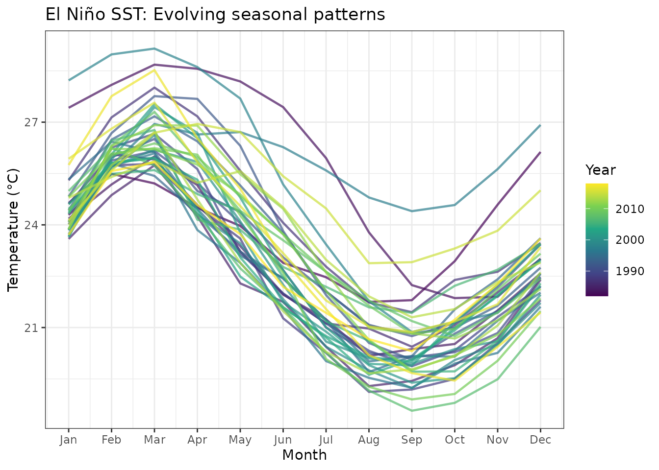
Monthly SST patterns across years.
Identifying ENSO events
Let’s examine annual means to identify major El Niño and La Niña events:
annual_means <- elnino_sst |>
  index_by(year) |>
  summarise(
    mean_temp = mean(temperature),
    .groups = "drop"
  ) |>
  mutate(
    anomaly = mean_temp - mean(mean_temp),
    phase = case_when(
      anomaly > 0.5 ~ "El Niño",
      anomaly < -0.5 ~ "La Niña",
      TRUE ~ "Neutral"
    )
  )

ggplot(annual_means, aes(x = year, y = anomaly, fill = phase)) +
  geom_col(alpha = 0.8) +
  geom_hline(yintercept = c(-0.5, 0.5), linetype = "dashed", alpha = 0.5) +
  scale_fill_manual(
    values = c("El Niño" = "darkred", "La Niña" = "darkblue", "Neutral" = "gray60"),
    name = "ENSO Phase"
  ) +
  labs(
    x = "Year",
    y = "Temperature anomaly (°C)",
    title = "ENSO phases in the observational record"
  )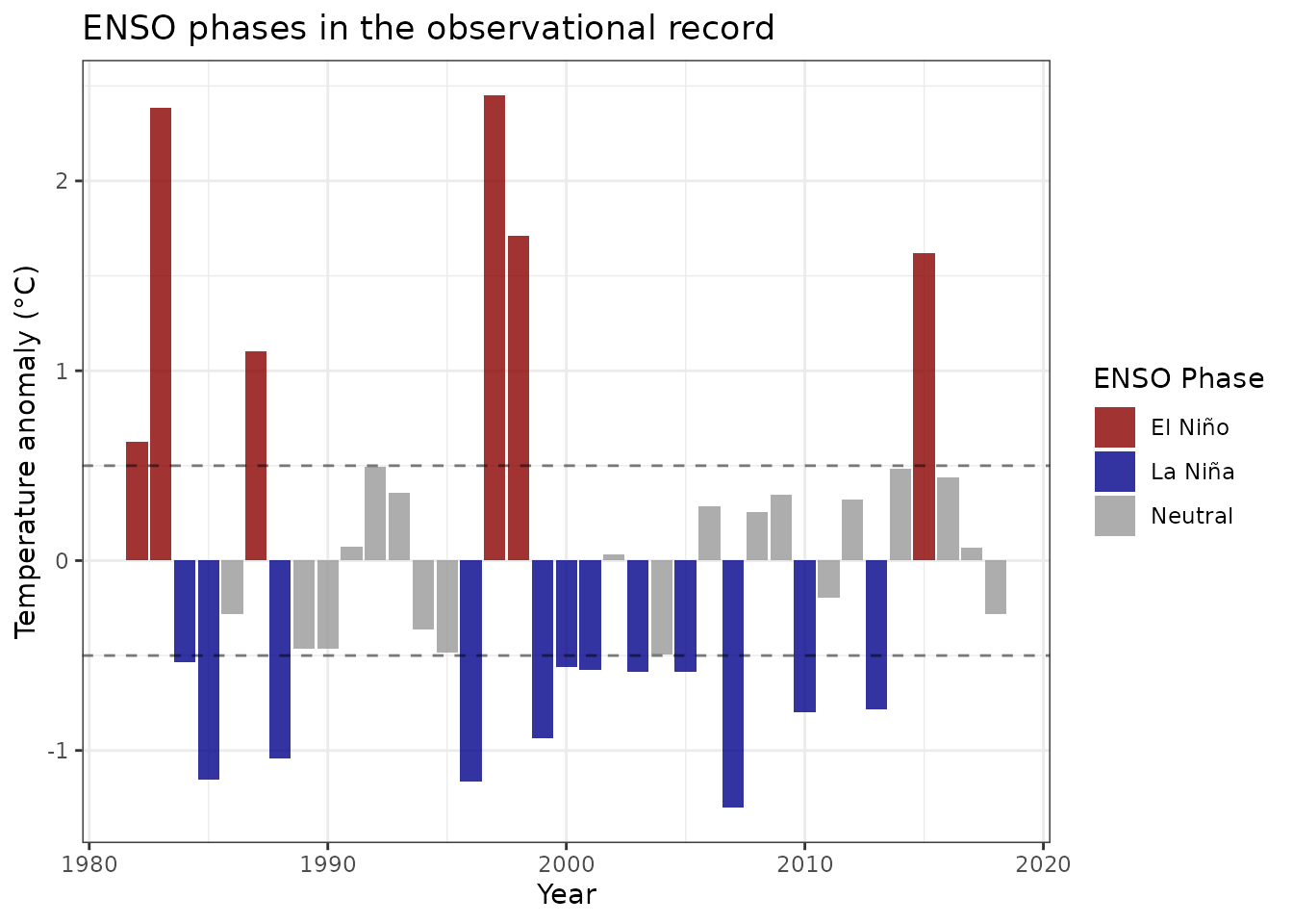
Annual mean SST anomalies highlighting major ENSO events. The 1997-1998 and 2015-2016 El Niño events stand out as extreme warm phases.
Modeling with cyclic splines
Train-test split for validation
We’ll use data through 2014 for training and reserve 2015-2018 for validation—a period that includes the major 2015-2016 El Niño:
The functional model specification
The key innovation is using cyclic cubic splines for the monthly pattern:
mod_elnino <- ffc_gam(
  temperature ~
    # Time-varying intercept: captures inter-annual variability
    fts(
      year,
      mean_only = TRUE,
      time_k = 15
    ) +

    # Time-varying seasonal pattern: cyclic splines ensure continuity
    fts(
      month,
      k = 12,
      bs = "cc",
      time_k = 15
    ),
  data = train_data,

  # Specify cyclic boundaries for month
  knots = list(month = c(0.5, 12.5)),
  time = "year",
  family = gaussian()
)
Understanding the model structure
summary(mod_elnino)
#>
#> Family: gaussian
#> Link function: identity
#>
#> Formula:
#> temperature ~ s(year, by = fts_year1_mean, bs = "ts", k = 15,
#>     m = 2, id = 1) + s(year, by = fts_bs_s_month__1, bs = "ts",
#>     k = 15, m = 2, id = 2) + s(year, by = fts_bs_s_month__2,
#>     bs = "ts", k = 15, m = 2, id = 2) + s(year, by = fts_bs_s_month__3,
#>     bs = "ts", k = 15, m = 2, id = 2) + s(year, by = fts_bs_s_month__4,
#>     bs = "ts", k = 15, m = 2, id = 2) + s(year, by = fts_bs_s_month__5,
#>     bs = "ts", k = 15, m = 2, id = 2) + s(year, by = fts_bs_s_month__6,
#>     bs = "ts", k = 15, m = 2, id = 2) + s(year, by = fts_bs_s_month__7,
#>     bs = "ts", k = 15, m = 2, id = 2) + s(year, by = fts_bs_s_month__8,
#>     bs = "ts", k = 15, m = 2, id = 2) + s(year, by = fts_bs_s_month__9,
#>     bs = "ts", k = 15, m = 2, id = 2) + s(year, by = fts_bs_s_month__10,
#>     bs = "ts", k = 15, m = 2, id = 2)
#>
#> Parametric coefficients:
#>             Estimate Std. Error t value Pr(>|t|)
#> (Intercept) 23.15273    0.05393   429.3   <2e-16 ***
#> ---
#> Signif. codes:  0 '***' 0.001 '**' 0.01 '*' 0.05 '.' 0.1 ' ' 1
#>
#> Approximate significance of smooth terms:
#>                               edf Ref.df      F  p-value
#> s(year):fts_year1_mean     13.597     14  7.663  < 2e-16 ***
#> s(year):fts_bs_s_month__1   1.893     15  1.619 1.01e-06 ***
#> s(year):fts_bs_s_month__2   2.013     15 16.873  < 2e-16 ***
#> s(year):fts_bs_s_month__3   1.954     15  7.713  < 2e-16 ***
#> s(year):fts_bs_s_month__4   2.005     15  2.699  < 2e-16 ***
#> s(year):fts_bs_s_month__5   1.994     15  0.097   0.4697
#> s(year):fts_bs_s_month__6   1.994     15  3.880  < 2e-16 ***
#> s(year):fts_bs_s_month__7   2.005     15 11.273  < 2e-16 ***
#> s(year):fts_bs_s_month__8   1.954     15  7.704  < 2e-16 ***
#> s(year):fts_bs_s_month__9   2.013     15  6.652  < 2e-16 ***
#> s(year):fts_bs_s_month__10  1.893     15  0.495   0.0122 *
#> ---
#> Signif. codes:  0 '***' 0.001 '**' 0.01 '*' 0.05 '.' 0.1 ' ' 1
#>
#> R-sq.(adj) =  0.804   Deviance explained =   82%
#> GCV = 1.2609  Scale est. = 1.1516    n = 396
The model decomposes SST into: 1. Smooth inter-annual
trend: fts(year, mean_only = TRUE)
2. Evolving seasonal cycle:
fts(month, bs = "cc") with cyclic boundaries
The cyclic spline ensures December flows smoothly into January, critical for seasonal forecasting.
Model diagnostics and interpretation
Visualizing fitted seasonal cycles
We can use plot_predictions() from marginaleffects for
quick and effortless effect plots on the outcome scale. For example, the
below plot shows how our model’s fitted seasonal shapes vary over
time:
plot_predictions(mod_elnino, condition = c("month", "year")) +
  labs(
    x = "Month",
    y = "Temperature (°C)",
    title = "Predicted training-period seasonal cycles"
  )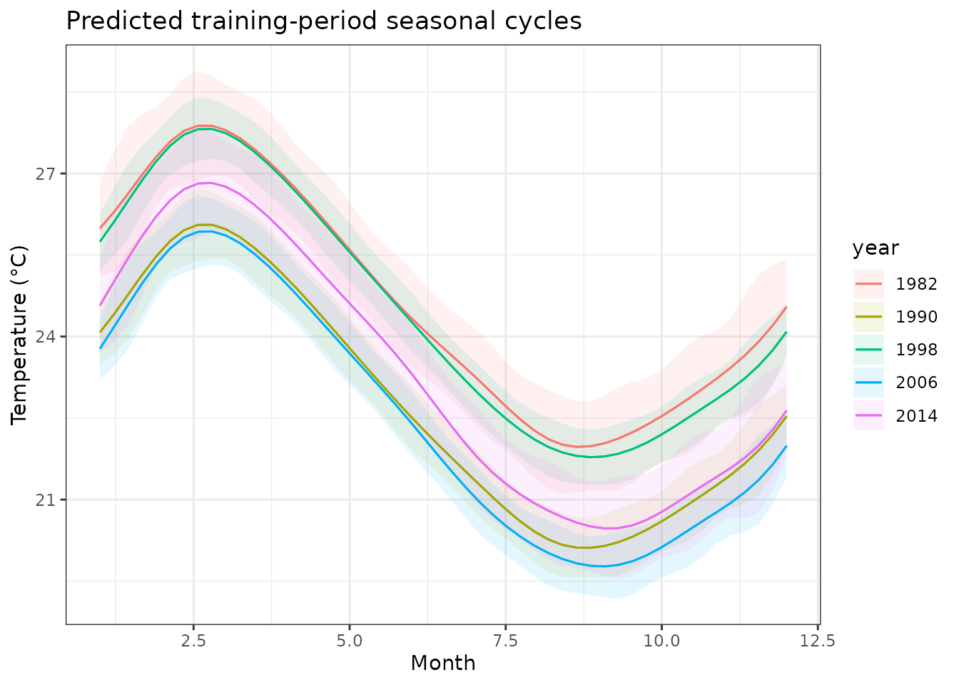
Fitted seasonal cycles for selected years. The model captures both the mean seasonal pattern and year-specific deviations.
Extracting time-varying coefficients
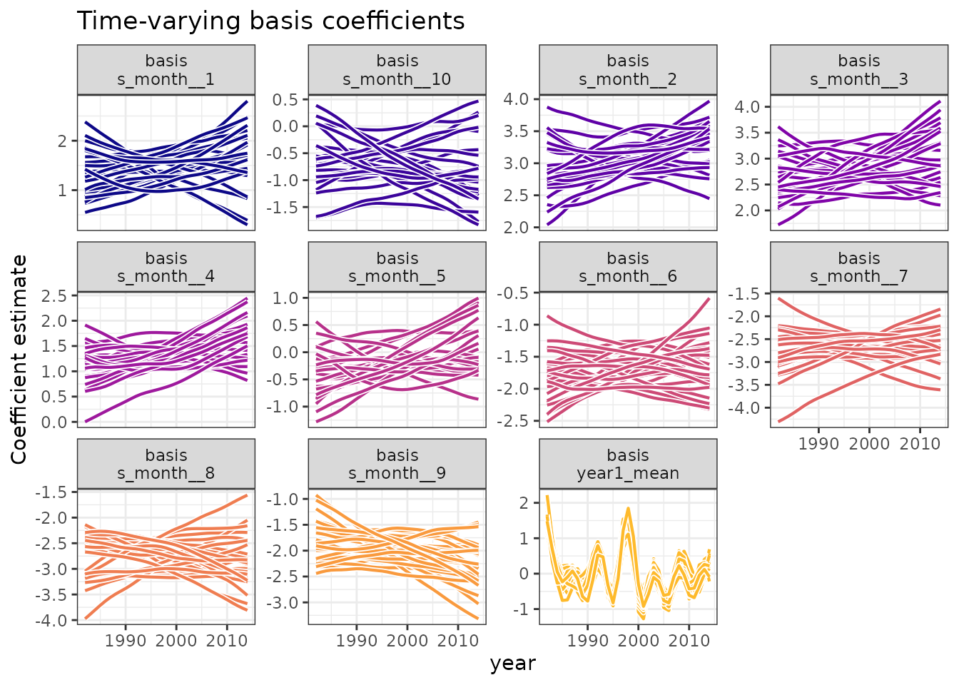
The functional coefficients reveal the underlying dynamics of the model:
# Extract coefficients with their time series structure
func_coefs <- fts_coefs(mod_elnino, summary = FALSE, times = 10)
print(func_coefs)
#> # A tibble: 9,075 × 6
#>    .basis         .parameter .time .estimate .realisation  year
#>  * <chr>          <chr>      <int>     <dbl>        <int> <int>
#>  1 fts_year1_mean location    1982    0.991             1  1982
#>  2 fts_year1_mean location    1983    0.415             1  1983
#>  3 fts_year1_mean location    1984    0.0490            1  1984
#>  4 fts_year1_mean location    1985   -0.0420            1  1985
#>  5 fts_year1_mean location    1986   -0.0395            1  1986
#>  6 fts_year1_mean location    1987   -0.198             1  1987
#>  7 fts_year1_mean location    1988   -0.528             1  1988
#>  8 fts_year1_mean location    1989   -0.701             1  1989
#>  9 fts_year1_mean location    1990   -0.398             1  1990
#> 10 fts_year1_mean location    1991    0.235             1  1991
#> # ℹ 9,065 more rows

# Visualize coefficient evolution
autoplot(func_coefs) +
  labs(
    title = "Time-varying basis coefficients",
  )
Forecasting ffc models
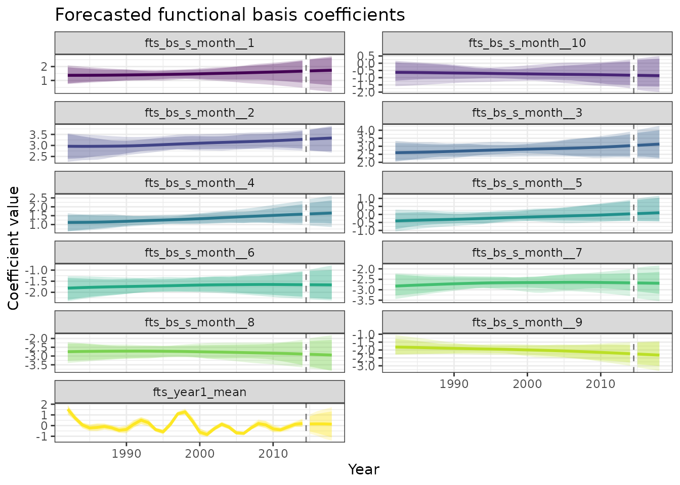
Exponential Smoothing forecasts of functional coefficients
The “ETS” model uses automatic exponential smoothing (Error, Trend, Seasonal) to independently forecast each basis function coefficient. ETS models are particularly effective for time series with clear trends and seasonal patterns, automatically selecting the optimal combination of error type (additive/multiplicative), trend (none/additive/damped), and seasonal components. Each coefficient is modeled separately, allowing the method to adapt to the unique temporal dynamics of each basis function. For more details on exponential smoothing methods, see Hyndman & Athanasopoulos (2021).
# Forecast coefficients using ETS
coef_forecast <- forecast(
  func_coefs,
  h = 4,
  times = 100,
  model = "ETS"
)

# Summarize forecasts for plotting
forecast_summary <- coef_forecast |>
  as_tibble() |>
  group_by(.basis, year) |>
  summarise(
    mean = mean(.sim),
    q05 = quantile(.sim, 0.05),
    q10 = quantile(.sim, 0.10),
    q90 = quantile(.sim, 0.90),
    q95 = quantile(.sim, 0.95),
    .groups = "drop"
  )

# Add historical values for context
historical_summary <- func_coefs |>
  as_tibble() |>
  group_by(.basis, year) |>
  summarise(
    mean = mean(.estimate),
    q05 = quantile(.estimate, 0.05),
    q10 = quantile(.estimate, 0.10),
    q90 = quantile(.estimate, 0.90),
    q95 = quantile(.estimate, 0.95),
    .groups = "drop"
  )

# Plot with ribbons for each basis function
ggplot(forecast_summary, aes(x = year)) +
  geom_ribbon(aes(ymin = q05, ymax = q95, fill = .basis), alpha = 0.2) +
  geom_ribbon(aes(ymin = q10, ymax = q90, fill = .basis), alpha = 0.3) +
  geom_line(aes(y = mean, color = .basis), linewidth = 1) +
  geom_ribbon(data = historical_summary,
              aes(ymin = q05, ymax = q95, fill = .basis), alpha = 0.2) +
  geom_ribbon(data = historical_summary,
              aes(ymin = q10, ymax = q90, fill = .basis), alpha = 0.3) +
  geom_line(data = historical_summary,
            aes(y = mean, color = .basis), linewidth = 1) +
  geom_vline(xintercept = 2014.5, linetype = "dashed", alpha = 0.5) +
  facet_wrap(~.basis, scales = "free_y", ncol = 2) +
  scale_fill_viridis_d(guide = "none") +
  scale_color_viridis_d(guide = "none") +
  labs(
    x = "Year",
    y = "Coefficient value",
    title = "Forecasted functional basis coefficients",
  )
Generating temperature forecasts with GPDF
Transform coefficient forecasts back to temperature predictions using Gaussian Process Dynamic Factor (GPDF) models. The GPDF approach models the evolution of multiple time series through a lower-dimensional set of latent factors, each following a Gaussian process. This captures complex dependencies between the different basis coefficients while providing principled uncertainty quantification. The model estimates K latent factors that drive the dynamics of all coefficients jointly, leading to more coherent forecasts than independent modeling. The Gaussian process priors on the factors allow for flexible non-linear dynamics while maintaining smoothness. For theoretical background on Gaussian processes, see Michael Betancourt’s case study.
# Create forecast data grid
forecast_grid <- expand.grid(
  month = 1:12,
  year = 2015:2018
) |>
  as_tibble() |>
  as_tsibble(index = year, key = month) |>
  arrange(year, month)

# Generate temperature forecasts
temp_forecasts <- forecast(
  mod_elnino,
  newdata = forecast_grid,
  model = "GPDF",
  mean_model = "ETS",
  K = 3,
  type = "response",
  chains = 1
)

# Combine with actual test data for comparison
forecast_results <- temp_forecasts |>
  bind_cols(forecast_grid) |>
  left_join(
    test_data |> select(year, month, actual = temperature),
    by = c("year", "month")
  )

# Plot forecasts vs actuals
ggplot(forecast_results, aes(x = month)) +
  geom_ribbon(aes(ymin = .q2.5, ymax = .q97.5), alpha = 0.2, fill = "darkred") +
  geom_ribbon(aes(ymin = .q10, ymax = .q90), alpha = 0.3, fill = "darkred") +
  geom_line(aes(y = .estimate), color = "darkred", linewidth = 1) +
  geom_line(aes(y = actual), color = "black", linewidth = 1.2) +
  geom_point(aes(y = actual), color = "black", size = 1.5) +
  facet_wrap(~year, ncol = 2) +
  scale_x_continuous(breaks = 1:12, labels = month.abb) +
  labs(
    x = "Month",
    y = "Temperature (C)",
    title = "Forecast validation: 2015-2018",
    subtitle = "Red: forecast (with 80% and 95% PIs), Black: observed"
  )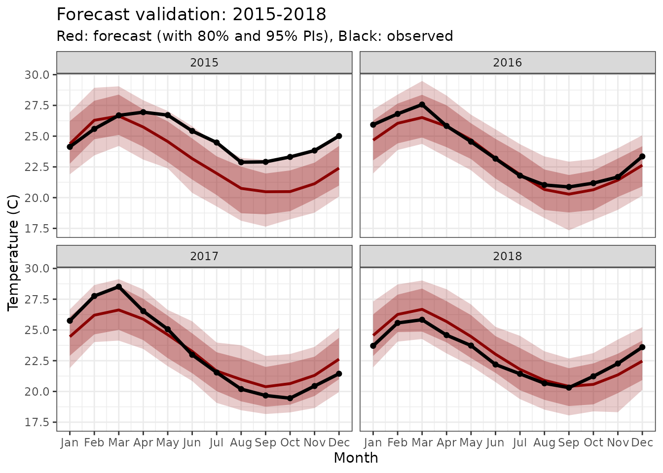
Forecasted seasonal cycles for 2015-2018 with uncertainty bands.
Spectral validation
We can also check if the model preserves the spectral characteristics of the original data. Spectral analysis decomposes time series into frequency components, revealing periodic patterns and their strengths. For El Niño data, we expect to see dominant annual cycles (frequency = 1) and potentially sub-annual harmonics. A good forecast should preserve these fundamental frequency characteristics, ensuring that the predicted seasonal patterns maintain the same spectral signature as the observed data. This validation is particularly important for functional forecasting where we want to ensure the cyclical nature of the data is maintained across the forecast horizon.
# Spectral analysis with uncertainty quantification
library(stats)

# Calculate spectrum for observed data
actual_ts <- ts(forecast_results$actual, frequency = 12)
actual_spec <- spectrum(actual_ts, plot = FALSE)

# Calculate spectra for forecast ensemble (using quantiles)
forecast_spectra <- list()
quantiles <- c(0.05, 0.10, 0.50, 0.90, 0.95)

for (q in quantiles) {
  forecast_q <- forecast_results[[paste0(".q", sprintf("%.0f", q * 100))]]
  if (is.null(forecast_q)) {
    # Handle different quantile naming conventions
    if (q == 0.05) forecast_q <- forecast_results$.q2.5
    else if (q == 0.95) forecast_q <- forecast_results$.q97.5
    else if (q == 0.50) forecast_q <- forecast_results$.estimate
    else next
  }

  forecast_ts_q <- ts(forecast_q, frequency = 12)
  forecast_spec_q <- spectrum(forecast_ts_q, plot = FALSE)

  forecast_spectra[[paste0("q", sprintf("%.0f", q * 100))]] <- data.frame(
    frequency = forecast_spec_q$freq,
    power = forecast_spec_q$spec,
    quantile = q
  )
}

# Combine spectral estimates
forecast_spec_df <- do.call(rbind, forecast_spectra)

# Calculate summary statistics across quantiles for each frequency
forecast_summary <- forecast_spec_df |>
  group_by(frequency) |>
  summarise(
    median = median(power),
    q05 = quantile(power, 0.05, na.rm = TRUE),
    q10 = quantile(power, 0.10, na.rm = TRUE),
    q90 = quantile(power, 0.90, na.rm = TRUE),
    q95 = quantile(power, 0.95, na.rm = TRUE),
    .groups = "drop"
  )

# Observed spectrum data
observed_df <- data.frame(
  frequency = actual_spec$freq,
  power = actual_spec$spec
)

# Create plot with uncertainty bands
ggplot() +
  # Forecast uncertainty bands
  geom_ribbon(
    data = forecast_summary,
    aes(x = frequency, ymin = log(q05), ymax = log(q95)),
    alpha = 0.2, fill = "darkred"
  ) +
  geom_ribbon(
    data = forecast_summary,
    aes(x = frequency, ymin = log(q10), ymax = log(q90)),
    alpha = 0.3, fill = "darkred"
  ) +
  # Forecast median
  geom_line(
    data = forecast_summary,
    aes(x = frequency, y = log(median)),
    color = "darkred", linewidth = 1.2
  ) +
  # Observed spectrum
  geom_line(
    data = observed_df,
    aes(x = frequency, y = log(power)),
    color = "black", linewidth = 1.2
  ) +
  # Highlight annual frequency
  geom_vline(xintercept = 1, linetype = "dashed", alpha = 0.6) +
  annotate("text", x = 1.1, y = max(log(observed_df$power)) * 0.9,
           label = "Annual cycle", hjust = 0, size = 3) +
  labs(
    x = "Frequency (cycles per year)",
    y = "Log spectral density",
    title = "Spectral validation with forecast uncertainty",
    subtitle = "Black: observed, Red: forecast median with 80% and 90% bands"
  ) +
  theme(legend.position = "none")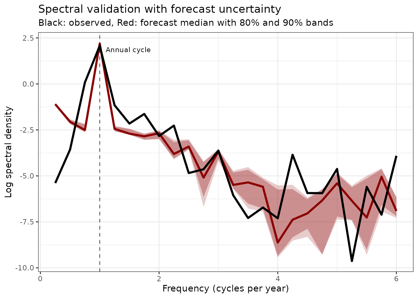
Spectral density comparison with uncertainties. The forecast preserves the key frequency components with quantified uncertainty bands.
Integration with fable ecosystem
The ffc package provides seamless integration with the
fable ecosystem
through the as_fable() function. This allows ffc forecasts
to be converted to fable objects, enabling use of fable’s accuracy
metrics and visualization tools:
# Convert ffc forecasts to fable format
fable_forecasts <- as_fable(
  mod_elnino,
  newdata = test_data,
  model = "ENS",
  mean_model = "ETS",
  type = "response",
  chains = 1
)

# Evaluate forecast accuracy using fable metrics
accuracy(fable_forecasts, test_data)
#> # A tibble: 12 × 11
#>    .model  month .type    ME  RMSE   MAE   MPE  MAPE  MASE RMSSE    ACF1
#>    <chr>   <int> <chr> <dbl> <dbl> <dbl> <dbl> <dbl> <dbl> <dbl>   <dbl>
#>  1 FFC_ENS     1 Test  0.542 1.10  0.943 2.03   3.72   NaN   NaN -0.236
#>  2 FFC_ENS     2 Test  0.132 1.00  0.898 0.373  3.37   NaN   NaN -0.310
#>  3 FFC_ENS     3 Test  0.488 1.13  0.926 1.66   3.36   NaN   NaN -0.408
#>  4 FFC_ENS     4 Test  0.252 0.865 0.749 0.861  2.88   NaN   NaN -0.406
#>  5 FFC_ENS     5 Test  0.541 1.23  0.923 1.98   3.59   NaN   NaN -0.201
#>  6 FFC_ENS     6 Test  0.261 1.15  0.841 0.881  3.47   NaN   NaN  0.0770
#>  7 FFC_ENS     7 Test  0.560 1.32  0.840 2.23   3.54   NaN   NaN  0.0548
#>  8 FFC_ENS     8 Test  0.432 1.13  0.838 1.81   3.82   NaN   NaN  0.140
#>  9 FFC_ENS     9 Test  0.714 1.40  0.983 3.10   4.47   NaN   NaN  0.0984
#> 10 FFC_ENS    10 Test  0.585 1.47  1.14  2.36   5.19   NaN   NaN  0.0282
#> 11 FFC_ENS    11 Test  0.630 1.39  1.10  2.56   4.85   NaN   NaN -0.0418
#> 12 FFC_ENS    12 Test  0.845 1.51  1.37  3.33   5.76   NaN   NaN -0.0638

# Create publication-ready plots using fable's autoplot
fable_forecasts |>
  autoplot(data = train_data, show_gap = FALSE, fill = "darkred") +
  labs(
    x = "Year",
    y = "Temperature (C)",
    title = "Forecasts broken down by month"
  )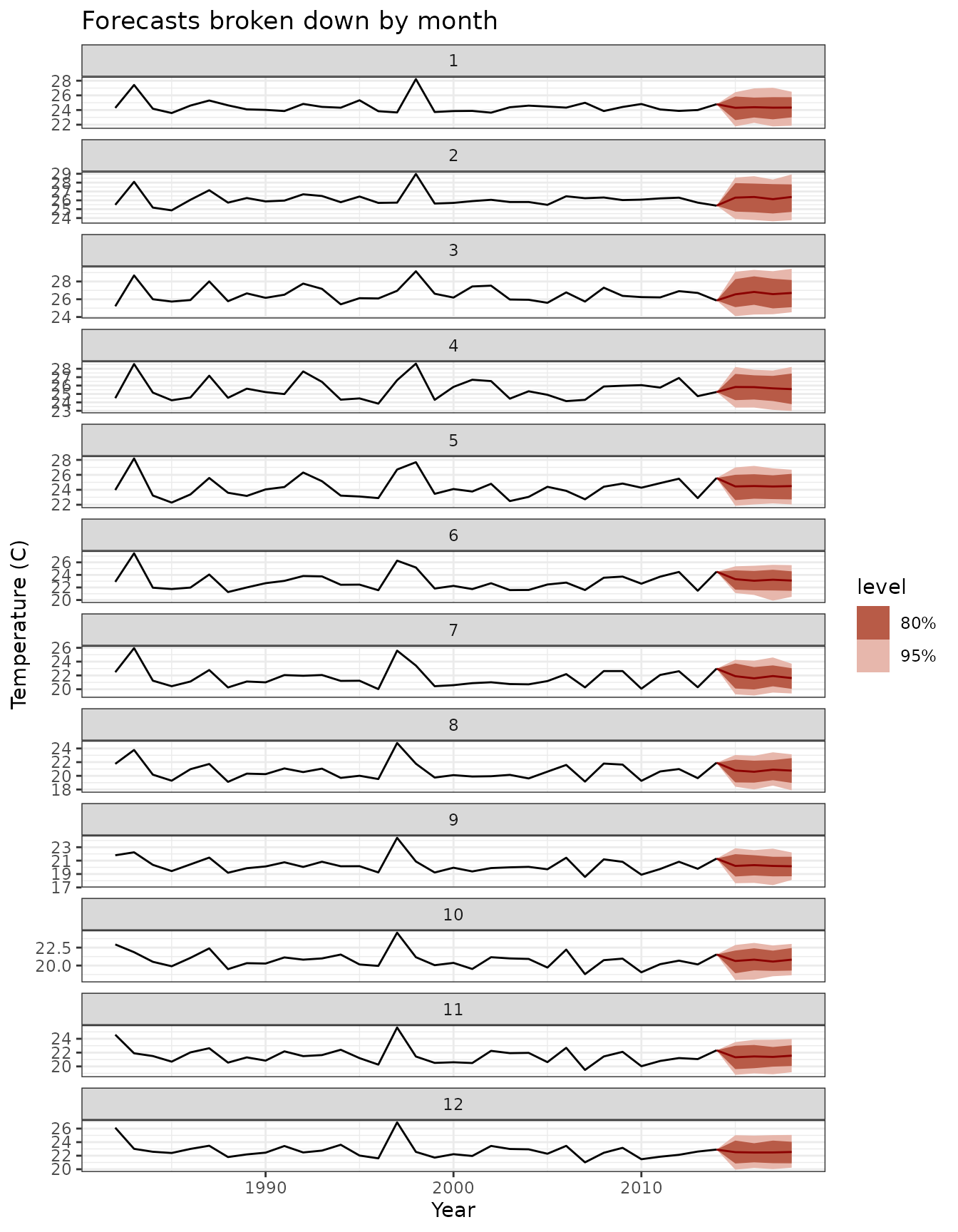
El Niño SST forecasts using ensemble model with fable integration. Red ribbons show prediction intervals, black lines show observed values.
This integration provides access to fable’s
comprehensive suite of forecast evaluation tools while maintaining the
flexibility and power of functional forecasting methods.
Key insights and best practices
When to use cyclic splines
Cyclic splines are essential when:
- Data has natural periodicity (seasonal, diurnal, etc.)
- Boundary continuity matters for interpretation
- Forecasting requires smooth transitions across periods
Key implementation tips:
- Set knots just outside the data range: c(0.5, 12.5) for
months 1-12
- Choose k (basis dimension) based on expected complexity
- Use bs = "cc" for cyclic cubic regression splines
For detailed guidance on modeling seasonal data with GAMs, see Simpson (2014).
Conclusion
This vignette demonstrated advanced functional forecasting techniques using El Niño SST data:
- Cyclic splines naturally handle seasonal patterns with boundary
continuity
- Time-varying coefficients* capture evolving relationships
- GPDF models provide sophisticated multivariate forecasting
- Comprehensive validation ensures reliable predictions
The ffc package integrates these methods in a unified
framework, enabling: - Flexible specification of functional
relationships
- State-of-the-art time series forecasting of coefficients
- Proper uncertainty quantification throughout
- Seamless integration with tidyverse and
fable ecosystems
Further reading
- Hyndman & Athanasopoulos (2021): Forecasting: Principles and Practice
- Wood (2017): Generalized Additive Models: An Introduction with R
- Ramsay & Silverman (2005): Functional Data Analysis
- NOAA Climate Prediction Center: ENSO diagnostics and forecasting